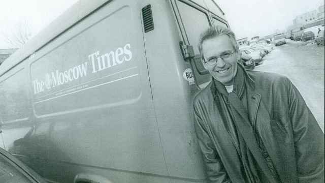
Since I was around Moscow anyway working on different projects, Derk asked me to come up with the first design for a free, tabloid-format newspaper that would be reminiscent of the style of the New York newspaper The Village Voice.
We had a great time putting the paper together in a couple of hotel rooms close to Kievsky train station. By then, the chief editor had brought her own art director from Paris, and I was just assisting. It was a colorful collective of people from all around the world, many of whom were setting up their own businesses.
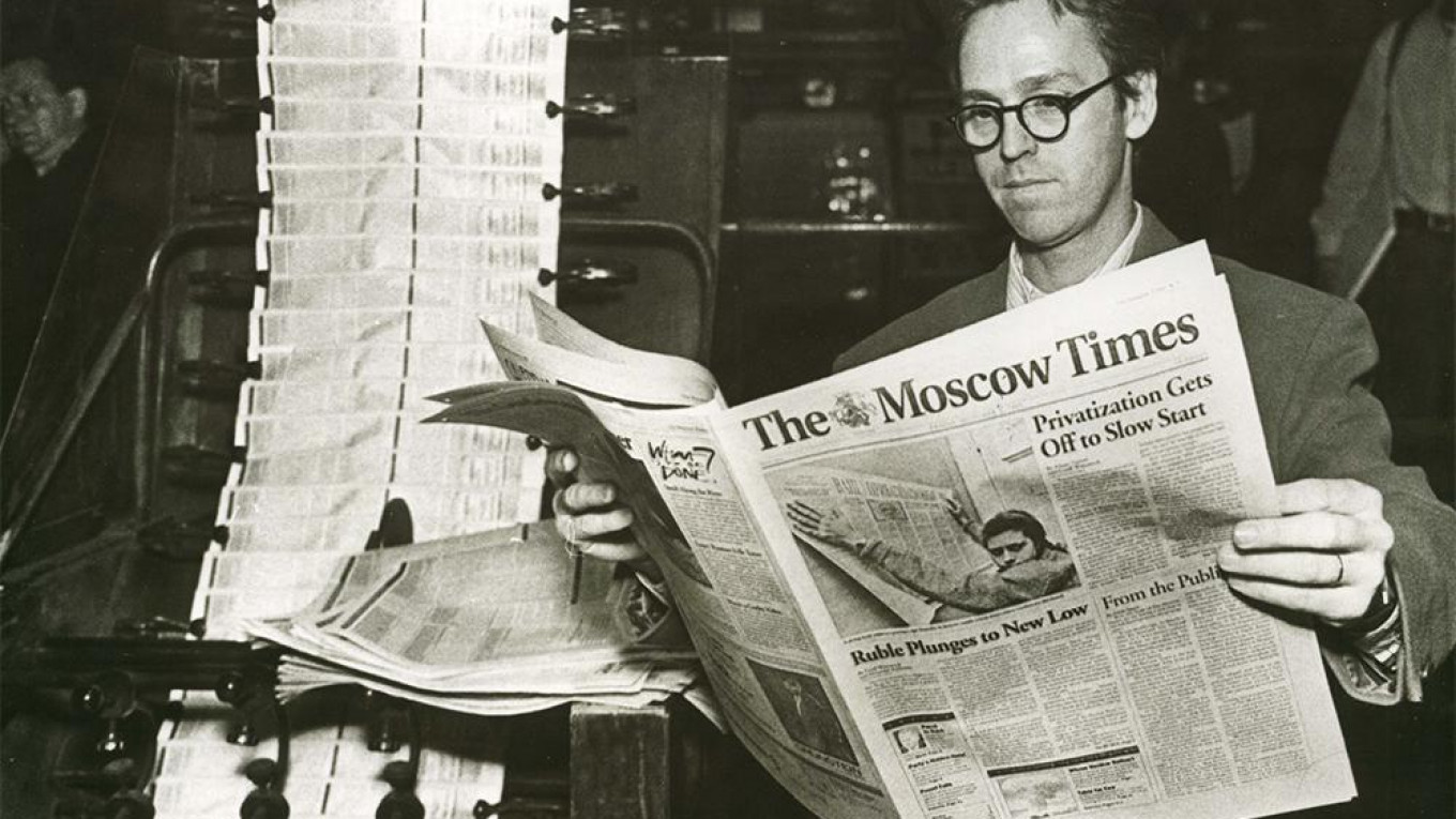
The Moscow Times was quite progressive for its time, especially by Moscow standards. But the production process itself was simple.
We used an A3 laser printer to produce the printing plates on clear film. A courier would then take the sheets over to the presses at the Soviet-era Pravda newspaper to be printed on paper.
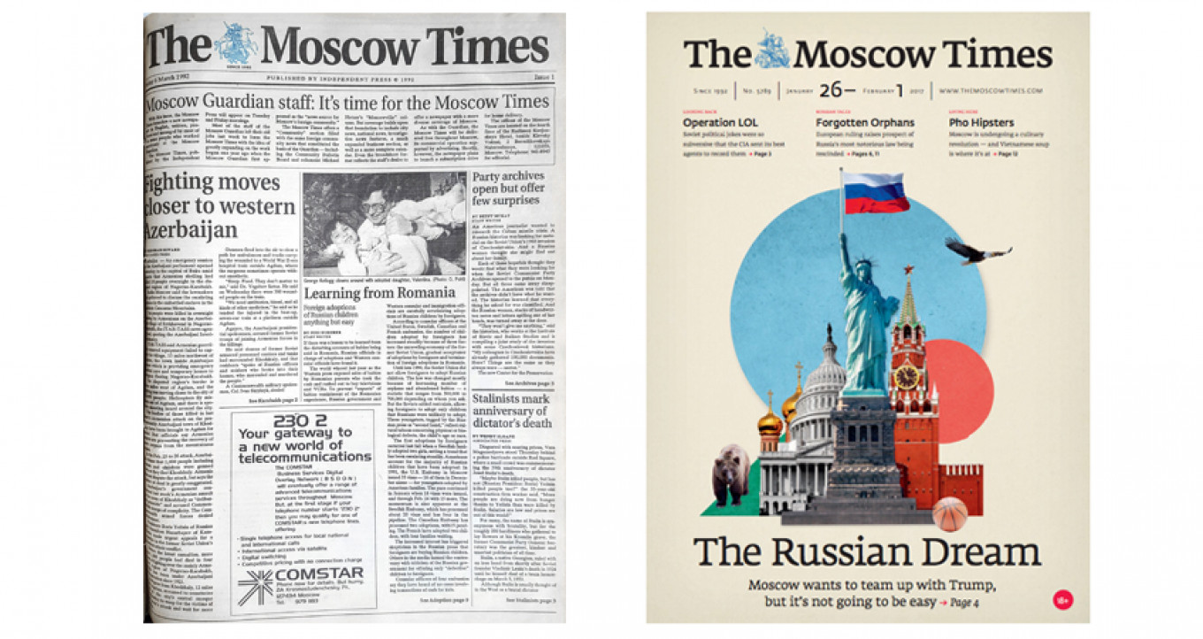
Derk Sauer came up with the name “The Moscow Times.” I remember a brainstorm session over the phone, yelling a bunch of names back and forth.
You could say I stole the idea to incorporate an illustration in the logo from the Dutch newspaper NRC Handelsblad. I thought it would work for The Moscow Times, too.
Because St. George is riding from left to right, it strengthens the dynamism of the paper’s logo. I’d read somewhere that St. George was the patron saint of Moscow and that he was on the city’s coat of arms.

Nowadays, you would start searching for images on the internet. But back then the internet didn’t really exist. So I found the image somewhere in a book, took a picture of the page, and later lifted the image of the emblem.
For the first font, I chose the condensed version of Plantin bold: it’s elegant but firm. It was later changed.
In the past 25 years, I’ve worked on hundreds of projects. But I am still happy that I had a hand in creating The Moscow Times.
This article is part of The Moscow Times' 25th anniversary special print edition. To view the entire issue click here.
A Message from The Moscow Times:
Dear readers,
We are facing unprecedented challenges. Russia's Prosecutor General's Office has designated The Moscow Times as an "undesirable" organization, criminalizing our work and putting our staff at risk of prosecution. This follows our earlier unjust labeling as a "foreign agent."
These actions are direct attempts to silence independent journalism in Russia. The authorities claim our work "discredits the decisions of the Russian leadership." We see things differently: we strive to provide accurate, unbiased reporting on Russia.
We, the journalists of The Moscow Times, refuse to be silenced. But to continue our work, we need your help.
Your support, no matter how small, makes a world of difference. If you can, please support us monthly starting from just $2. It's quick to set up, and every contribution makes a significant impact.
By supporting The Moscow Times, you're defending open, independent journalism in the face of repression. Thank you for standing with us.
Remind me later.