Eager to boost tourism, Russia has unveiled its first logo:? a simple piece of artwork with the words "My Russia" portrayed in the white, blue and red colors of the national flag.
But some observers are less than impressed with the effort, saying it lacks appeal and fails to epitomize the Russian-ness of Russia. One said the way to encourage tourism would be to ease visa rules, not create a logo.
The logo, ordered by the Federal Tourism Agency, shows the word "My" in dark blue and in a variety of fancy fonts, depending on where the logo is displayed. The word "Russia" is in red and always in solid block letters. The words are presented on a white background and available in two languages, Russian and English.
The key goal of creating the logo is to increase recognition of Russia as a travel destination for foreign and domestic tourists and "to indicate that it's an attractive country worth visiting," said Irina Shchegolkova, a spokeswoman for the Federal Tourism Agency.
The logo will be used as part of a 332 billion ruble ($10.4 billion) government campaign to develop tourism over the next six years and will be depicted on billboards as well as stands at exhibitions and conferences, Shchegolkova said by telephone Tuesday.
Her agency announced a tender for the logo late last year, offering 500,000 rubles for the winning design. It ended up paying 155,000 rubles for the logo offered by Artishok, a graphic-design company that beat out three rivals, she said.
But the logo, unveiled Friday, has gotten a lukewarm reception.
The logo looks too formal and doesn't encourage tourism, said Arseny Meshcheryakov, a creative director at Agey Tomesh, a graphic-design company. "It was not an easy task, but the logo doesn't achieve its intended goal," he said.
"The best way to improve Russia's image abroad is to ease the visa regime," outspoken rock music critic Artemy Troitsky said on his website Monday.
Indeed, the Russian Tourism Union says the major problems scaring off foreign tourists include an unfavorable visa regime, high ticket prices and poor quality of services. About 2.3 million foreigners visited Russia last year, a slight increase from 2.1 million tourists in 2010, according to the State Statistics Service.
Russia will ease many types of visas, including those for tourists, with the United States from Sept. 9 as part of a "reset" in relations. But many other foreign tourists will still face a bureaucratic headache in obtaining visas.
Alexei Leibovich, creative director at BE!MA, said that the new logo doesn't highlight any features that Russia wants to be associated with, like the national spirit, nanotechnology or the great outdoors.
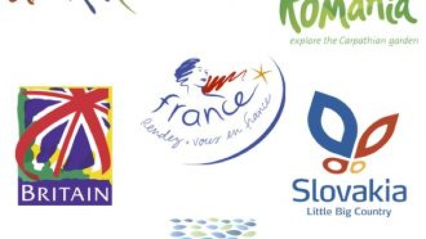
"The logo doesn't convey any mood, message or idea," he said in e-mailed comments, adding that using a stylized font could improve it. "Look at the more accurate way some other countries do it."
Among the countries with their own tourism logotypes that have proved to be popular travel destinations are Turkey, Britain, Cuba, Algeria, Egypt and Croatia.
The Federal Tourism Agency countered that Russia shouldn't be associated only with nesting dolls, ballet or St. Basil's Cathedral. "It's much broader, and it's hard to find a picture that would capture its opulence," Shchegolkova said.
The logo's designer agreed, saying the idea was to stay away from traditional stereotypes associated with Russia. Yulia Solovyova, project manager at Artishok, said Russia offers various kinds of tourism, and everyone can find something depending on their preferences.
Solovyova said that the logo illustrates the notion that everyone has a Russia of his or her own by using various fonts to write the word "My," while "Russia" is always written in the same font.
The slogan that will accompany the logo, "Reveal your own Russia," also serves that purpose, she said.
The most well-known — and de facto — logo for Russia remains the mascot of the 1980 Summer Olympics hosted by Moscow. It depicts a smiling brown bear, a symbol traditionally associated with Russia.
Related articles:
A Message from The Moscow Times:
Dear readers,
We are facing unprecedented challenges. Russia's Prosecutor General's Office has designated The Moscow Times as an "undesirable" organization, criminalizing our work and putting our staff at risk of prosecution. This follows our earlier unjust labeling as a "foreign agent."
These actions are direct attempts to silence independent journalism in Russia. The authorities claim our work "discredits the decisions of the Russian leadership." We see things differently: we strive to provide accurate, unbiased reporting on Russia.
We, the journalists of The Moscow Times, refuse to be silenced. But to continue our work, we need your help.
Your support, no matter how small, makes a world of difference. If you can, please support us monthly starting from just $2. It's quick to set up, and every contribution makes a significant impact.
By supporting The Moscow Times, you're defending open, independent journalism in the face of repression. Thank you for standing with us.
Remind me later.


