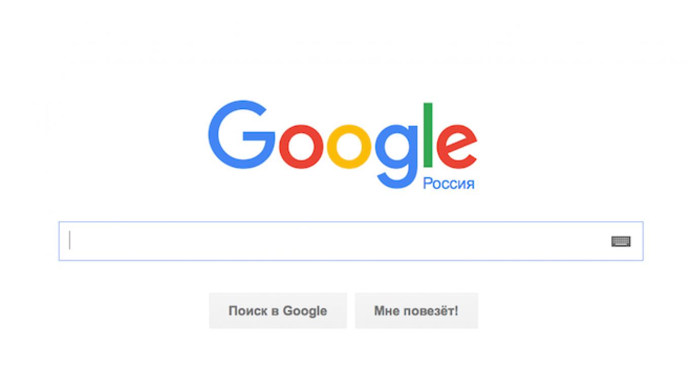
The basic design for Google's new logo was created by a Russian designer some seven years ago, according to U.S. technology website Daily Tech.
Denis Kortunov, user interface director at Swiss software company Acronis, came up with the idea for the new Google logo — a four-color letter “G” — back in 2008, Daily Tech reported last week.
In 2008, Kortunov, who is also the founder of Russian web design company Turbomilk, published an article on his company's blog criticizing Google's logo at that time and suggested his own version, which has a very similar design to the U.S. company's new logo.
Kortunov said that Google's designers had in fact come up with the idea for the new logo themselves, but noticing the similarity with his work decided to eliminate any possible misunderstanding. They agreed on the use of his work about a month ago, Kortunov told the RBC news agency.
The designer said he didn't want to discuss the details of his agreement with Google.
The final version of the Google logo is not identical to Kortunov's original, Daily Tech points out. Google's new logo is slightly thicker than Kortunov's original design and has a different arrangement of colors.
Kortunov's company Turbomilk previously worked with Google on the annual IT conference 404 Festival in the Volga River city of Samara, according to RBC. Turbomilk also created a pixelated emblem for Russia's presidential website, Kremlin.ru.
Google unveiled its new logo on Sept. 1. The company has changed its logo five times since its founding in 1998, according to Google's official blog.
A Message from The Moscow Times:
Dear readers,
We are facing unprecedented challenges. Russia's Prosecutor General's Office has designated The Moscow Times as an "undesirable" organization, criminalizing our work and putting our staff at risk of prosecution. This follows our earlier unjust labeling as a "foreign agent."
These actions are direct attempts to silence independent journalism in Russia. The authorities claim our work "discredits the decisions of the Russian leadership." We see things differently: we strive to provide accurate, unbiased reporting on Russia.
We, the journalists of The Moscow Times, refuse to be silenced. But to continue our work, we need your help.
Your support, no matter how small, makes a world of difference. If you can, please support us monthly starting from just $2. It's quick to set up, and every contribution makes a significant impact.
By supporting The Moscow Times, you're defending open, independent journalism in the face of repression. Thank you for standing with us.
Remind me later.